In today's digital landscape, capturing attention and converting website visitors is more important than ever. Landing pages play a crucial role in this process. But what exactly are they?
A landing page is a standalone web page designed with a specific goal in mind, typically driving actions such as purchases, signups, or downloads.
It's distinct from a webpage on your main website in that it's not cluttered with various navigation menus or links that might distract visitors from the intended action. Landing pages are like laser-focused salespeople, guiding visitors towards a specific conversion.
By crafting high-converting landing pages, you can significantly increase your chances of transforming website visitors into paying customers, ultimately boosting sales and achieving your marketing objectives.
Now, let's delve deeper into the different types of landing pages and the key elements that make them successful... (continue with the rest of the content you provided).
Types Of Landing Page
There's no one-size-fits-all approach to landing pages. Different types cater to distinct goals:
Clickthrough Landing Pages:
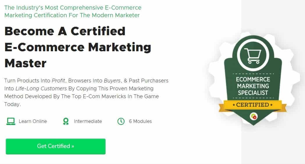
Imagine these as informational waypoints. They act as intermediaries, highlighting the key benefits of an offer and directing users to a dedicated sales page for the final purchase. Think of them as trailers for a movie, piquing interest and prompting viewers to head to the theater (the sales page) for the full experience.
Example:
Subscription Pages:
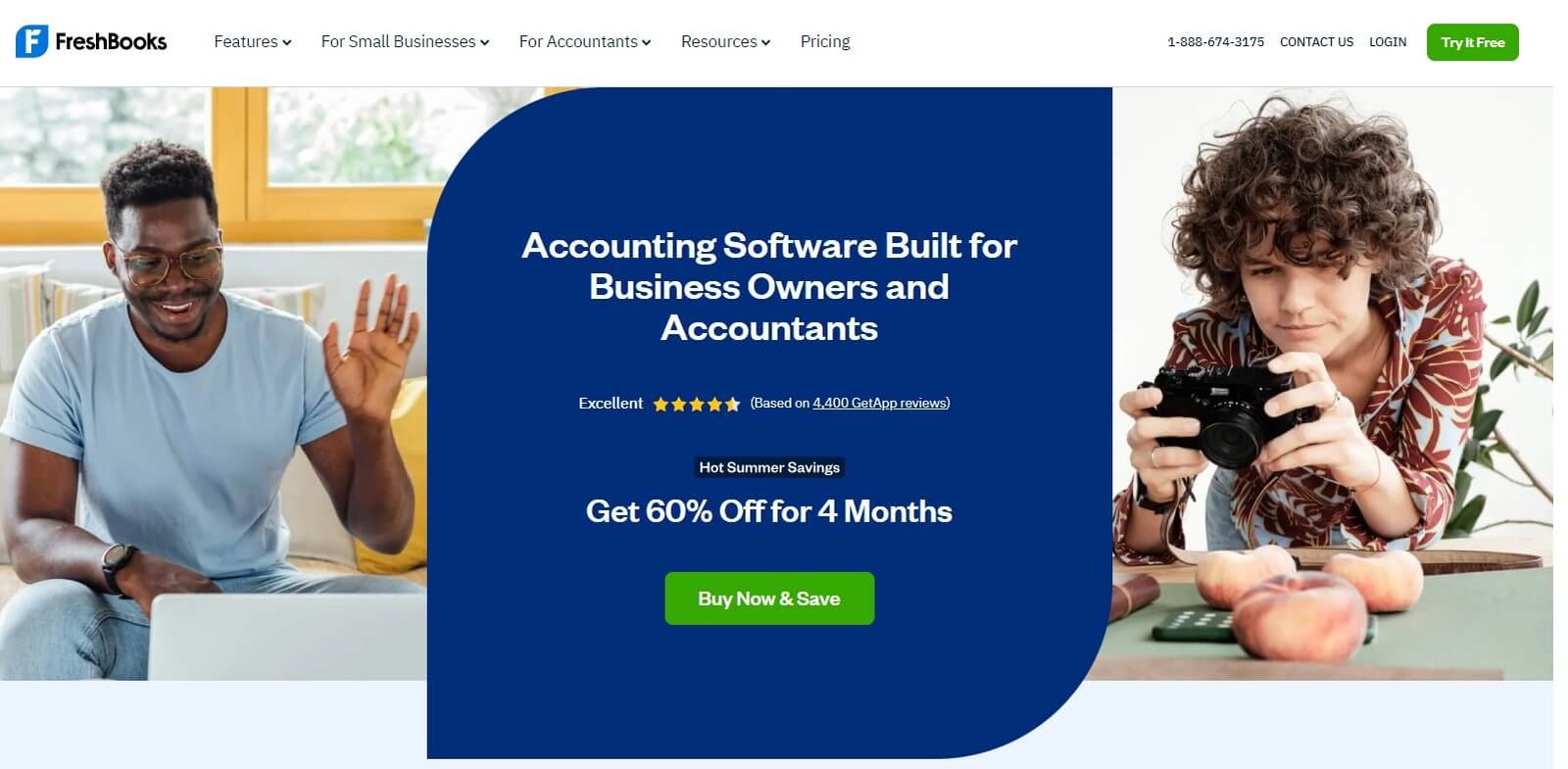
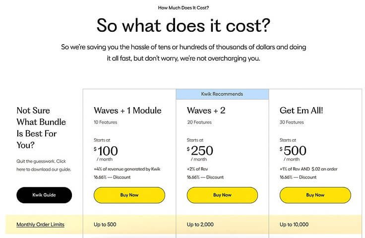
A subscription page is the online salesperson for a recurring service or product. It entices visitors with a clear value proposition, showcasing the benefits and how it solves their problems. User-friendly forms capture necessary information to initiate the subscription process. Different subscription tiers cater to diverse budgets and needs, while a clear call to action encourages them to become a subscriber.
These pages are crucial for businesses offering digital products like streaming services or software, physical subscription boxes, or even premium content from creators.
The benefits are clear: predictable income through recurring payments, fostering long-term customer relationships, and collecting valuable data to improve offerings. Put simply, subscription pages are a win-win for businesses and users, offering valuable products or services in exchange for loyal customers and consistent revenue.
Example:
Lead Generation Pages:
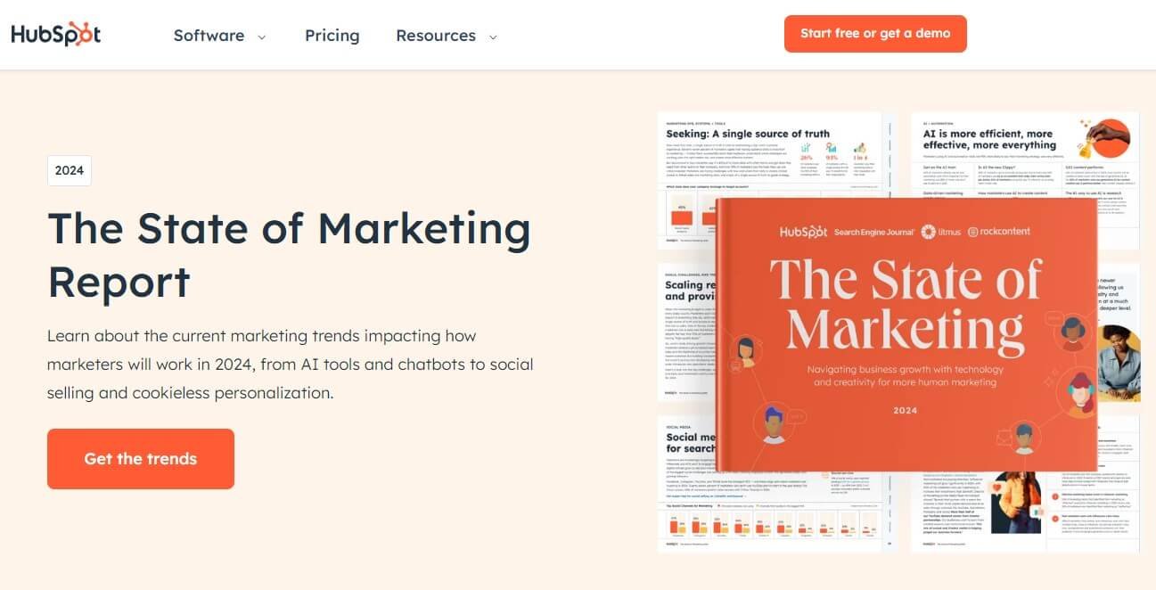
The name says it all! Lead generation pages focus on collecting leads by offering valuable free resources – white papers, demos, consultations – in exchange for user information. This information is often gathered through strategically placed forms, allowing you to qualify potential customers and nurture them through the sales funnel.
Sales Pages:
These landing pages are laser-focused on driving conversions. They typically showcase product features in detail, highlight the benefits of your offering, and prominently display clear calls to action (CTAs) that encourage users to purchase.
Think of them as detailed product descriptions in a well-lit store, complete with persuasive salespeople (the copywriting) urging you to make a purchase.
Once you've identified the type of landing page that best suits your marketing goals, it's time to delve into the specifics of crafting a compelling experience that resonates with your target audience. Here are some key elements to consider:
Example:
Here are some of the common purposes :
How To Create A Landing Page?
A landing page meets, of course, the specifics of your business and your positioning.
There is still good practice to consider when designing or optimizing your landing page.
All key points that will be listed here are not intangible rules and will be tested one by one by removing or adding an element to determine what works for you and only for you.
We will see how to make these further tests in the article:
Design:
First impressions matter. A user-friendly and visually appealing design is paramount for grabbing attention and keeping visitors engaged. Imagine a cluttered storefront – it wouldn't be very inviting, would it? The same goes for landing pages.
Ensure your landing page is optimized for mobile devices, as a significant portion of web traffic comes from smartphones and tablets.
A/B testing different design elements like layout, color schemes, and image placement can be your secret weapon. By testing variations, you can discover what resonates best with your target audience, ultimately leading to higher conversion rates.
Compelling Headlines and Subheadings:
Think of your headline as a billboard for your offer. It has mere seconds to capture visitor attention and convince them to stay. Make it clear, concise, and benefit-driven. Imagine walking past a billboard that simply says "Product X." Not very informative, right? Craft headlines that address the specific needs and pain points of your target audience.
For example, instead of "Weight Loss Solution," try "Finally Reach Your Weight Loss Goals: Download Our Free Guide Today!" Subheadings can further break down the information and guide users through the content. Think of them as chapter titles in a book, giving readers a glimpse into what each section offers.
Persuasive Copywriting:
People don't care about features – they care about benefits. Your landing page copy should focus on the "why" behind your product or service, not just the features themselves. Answer your audience's potential questions and address any concerns they might have directly on the landing page.
Imagine a salesperson who simply lists product specifications without explaining how those features benefit the customer.
Not very persuasive, is it? Use clear, concise, and benefit-driven language with short, punchy sentences. While maintaining a professional tone, inject some personality to connect with your audience on a human level.
Strong Call to Action (CTA):

Tell visitors exactly what you want them to do with clear and compelling CTAs. Don't leave them guessing! A strong CTA button is like a shop's "Buy Now" sign. Use strong verbs and contrasting colors to make the CTA button stand out. Whether it's "Buy Now," "Download Your Free Guide," or "Schedule a Demo," your CTA should be crystal clear.
Trust and Credibility Indicators:
Building trust with visitors is essential for encouraging conversions. Imagine walking into a store that has no customer reviews or logos of reputable companies displayed.
Would you feel comfortable buying something? Include elements like customer testimonials,logos of reputable clients you've worked with, and security seals to demonstrate your legitimacy and trustworthiness.
Leverage social proof by showcasing positive reviews from satisfied customers, case studies that highlight successful client experiences, or even mentions of your brand in trusted media outlets. By incorporating these trust signals, you're essentially saying to visitors, "Look, other people trust us, and you can too!"
Forms:
Keep your forms short and simple. Imagine a form with ten fields requesting everything from your life story to your favorite color. Overwhelming, right? Only request essential information for your marketing or sales goals. Clearly explain why you need the information requested, and use clear labels and error messages to ensure a smooth user experience. Nobody likes filling out a form riddled with cryptic instructions or confusing error messages.
Images and Videos:
High-quality visuals can significantly enhance your landing page and break up text-heavy content. People are visual creatures, and captivating images that complement your message and resonate with your target audience can grab attention and hold it.
Consider including lifestyle images that showcase how your product or service can be seamlessly integrated into everyday life. Videos can be particularly effective, allowing you to showcase your product or service in action and provide a more engaging experience compared to static images.
SEO Optimization (if applicable):
While SEO might not always be the primary goal for landing pages, for those you want to rank organically in search results, basic optimization is important. Imagine a hidden storefront on a deserted street – not many people will stumble upon it.
Optimize titles, meta descriptions, and content for relevant keywords to improve discoverability in search engines. This way, when potential customers search for solutions related to your offering, your landing page has a chance of appearing in search results, driving more qualified traffic your way.
Landing Page Speed:
Nobody likes a slow website. Imagine a store with long lines and sluggish service – frustrating, right? Ensure your landing page loads quickly to avoid losing visitors due to impatience. Use tools like Google PageSpeed Insights to test and improve your landing page speed for optimal performance. A fast-loading landing page keeps visitors engaged and increases the likelihood of conversions.
Conversion Tracking:
Tracking conversions is essential for measuring the effectiveness of your landing pages. Imagine running a store without any way to track sales – how would you know what's working and what's not?
Utilize analytics tools to monitor traffic, conversions (signups, purchases, etc.), and identify areas for improvement. Analyze what elements are leading to conversions and which ones are deterring visitors. By continuously testing and optimizing based on data, you can transform your landing pages into conversion machines.
Thank You Page:
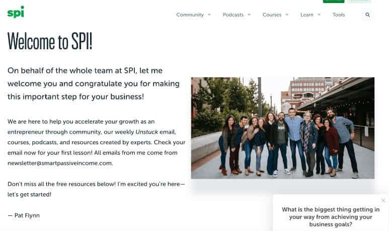
Don't neglect the thank you page that appears after a conversion. Imagine a store that simply says "Thank you" after a purchase and sends you on your way. A missed opportunity!
Use this space to deliver additional value, such as a confirmation email with download links for free resources or a relevant blog post recommendation. Encourage further engagement and nurture the relationship with your new lead or customer. This could involve offering them a discount on their next purchase or subscribing them to a newsletter filled with valuable content.
By acknowledging a user's action with a positive and well-designed Thank You Page, you create a sense of trust and appreciation. This reinforces the user's decision to interact with your brand and leaves a lasting positive impression.
A/B Testing:
The key to landing page success lies in a data-driven approach. Imagine making decisions about your store layout or product offerings based on gut instinct alone – not very reliable, is it?
A/B testing allows you to compare different versions of your landing page elements, like headlines, CTAs, or image placements, to see which version performs better.
By continuously testing and iterating based on data, you can optimize your landing pages for maximum conversions. Think of it as a scientific experiment, where you test different variables to see which ones yield the best results.
Color Psychology:
Colors can evoke emotions and influence user behavior. Imagine painting your store bright red – might not be the most calming ambiance for customers, right? Understanding color psychology can be beneficial when designing your landing page.
For instance, red is often associated with urgency and can be effective for CTAs, while green evokes feelings of trust and growth, making it suitable for financial or health-related landing pages.
However, the most effective color scheme depends on your target audience and brand identity. A/B testing different color combinations is crucial for finding what works best for your specific landing page. Don't be afraid to experiment and see what resonates with your visitors.
Yellow: optimism and youth, captures the visitor's attention
Orange: aggressiveness, captures the visitor's attention on a particular call-to-action button
Red: energy, created a sense of urgency, often used during the sales and in the food sector
Rose: Romantic and feminine, used for products for women or teenage girls
Blue: creates a feeling of security and confidence, often used by banks or business services
Violet: calm, quiet, often linked to beauty and wellness, cosmetics and anti-aging
Green: related to health, the easiest color to understand for the human eye, used in finance or entertainment sites
Black: power, seen as luxurious and sophisticated
Tools To Create A Landing Page
In addition to the importance of crafting compelling content and design for your landing pages, the right tools can streamline the creation process and offer valuable features. Here are some popular options to consider, categorized based on their functionalities:
Landing Page Builders (Drag-and-Drop).
- These user-friendly platforms allow you to visually design landing pages without needing coding expertise. They typically offer pre-built templates, drag-and-drop functionality, and a variety of customization options.
- Examples:Thrive for landing pages ,Unbounce, Wix Landing Pages, Leadpages, Instapage, Carrd (for simple landing pages)
Website Builders.
- If you're already managing a website, some website builders offer built-in landing page functionalities. This can be a convenient option if you want consistency with your website's design.
- Examples: Squarespace, WordPress (with landing page plugins like Elementor)
Marketing Automation Platforms.
- These comprehensive platforms often include landing page creation tools alongside features for email marketing, lead nurturing, and analytics.
- Examples: HubSpot, ActiveCampaign, Mailchimp (limited landing page features)
Coding (For Developers).
- If you have web development expertise or access to a developer, you can create custom landing pages using HTML, CSS, and JavaScript. This offers maximum flexibility but requires technical knowledge.
Choosing the Right Tool.
The best tool for you depends on your technical skills, budget, and specific needs. Consider these factors when making your selection:
- Ease of Use: If you're not tech-savvy, a drag-and-drop builder is ideal.
- Features: Identify the functionalities you need, like A/B testing, analytics, or integrations with other marketing tools.
- Budget: Compare pricing plans and features to find a solution that fits your budget.
- Scalability: Consider your future needs and choose a platform that can scale with your business.
By understanding your requirements and exploring the available options, you can select the perfect tool to create high-converting landing pages that propel your marketing efforts forward.
Conclusion
By following these tips and incorporating the latest trends in landing page design and optimization, you can create compelling landing pages that effectively convert visitors into leads and customers. Remember, your landing page is a digital salesperson working tirelessly to achieve your marketing goals. Craft it with care, optimize it strategically, and watch your conversions soar!
